|
|
John Zorn - Sacred Visions
|
It is impossible for me to say enough about my dearest friend, Tzadik
designer Heung-Heung Chin. Her imagination is boundless, her style
deliriously beautiful, her craft meticulously elegant, and her passion
endlessly inspiring.
Simply put — Heung-Heung Chin is a genius!
— John Zorn
Graphic designer Heung-Heung Chin studied 2D, appreciating all artistic
disciplines while enjoying the energy of cities worldwide. She joined forces
early on with composer, saxophonist, and organizer John Zorn and became a
large part of the visual identity of the Tzadik label. In the music circuit,
well known figures such as John Lurie, Erik Friedlander, Lou Reed, Dave
Lombardo, etc. have asked her to design cover art, programs, show posters,
and more. She remains one of John Zorn’s close collaborators, as she has
realized most of his booklets (CDs, DVDs, LPs, books) a few years after Tzadik was
established. Her creations (illustrations, but also layout, formats, inks,
and materials) are notable for their stylistic amplitude, referencing
several periods in the history of graphic design for a result that is always
remarkable, often unforgettable. Each new release has provided an
opportunity for the prolific artist to push experimentation and daring
further, and for the listener and fan to marvel at the degree of
sophistication deployed. She is an essential element to the Zorniverse,
which contains multitudes of musical genres, colleagues, and
satellites.
Interview by
David Cristol

|
|
John Zorn - Meditations on the Tarot
|
David Cristol: What is your background? How did you get into design and
associate with the music scene?
Heung-Heung Chin: I graduated from The Cooper Union School of Art where I
focused on 2D after the Foundation year: graphic design, experimental
typography, art of the book (bookbinding), offset lithography, basic
photography, silkscreen, lithography, etching, history of graphic design,
calligraphy, independent study graphic design, professional practice,
etc.
Hips Road [John Zorn’s global umbrella, of which Tzadik and The Stone are
under] was part of an independent study course Zorn developed for me. I met
him at one of his shows.
Were you involved in the now-defunct label Avant?
Other labels?
I designed an Avant catalog in brochure form. Occasionally other artists need
a designer for a single project: 31G, Blue Note Records, Brassland, Sister Ray
Recordings, independent artists like iNFiNiEN, etc.
Ikue Mori has also designed some record covers; have you ever worked
together?
She has Tzadik releases where I’ve taken care of some of those packages on
various series. There have been some projects where I’ve art directed photos.
The Oracles Series [dedicated to women musicians] is my own design. Artists
need to submit their hi-res artwork and text so it can be plugged into the
format. The Phantom Orchard portraits for Orra were under my art direction.
There were a bunch of peacock feathers that I decided would work for the
images. Phantom Orchard Orchestra’s Trouble in Paradise features her handmade
puppets/dolls and photography. On the Spectrum series, her dolls are featured
again, same process as for Trouble in Paradise. Craig Taborn and Ikue Mori’s
Highsmith includes my portraits of them. Currently for most CDs, she provides
the artwork and I will just place them in the package.

|
|
Phantom Orchard - Orra
|
Do you have other activities apart from Tzadik? Not necessarily involving
music? And where does your inspiration come from?
I’m a freelance graphic designer. Sometimes I create digital illustrations
that are sold as fine art. My first solo show at Gallery 30 South featured
illustration, jewelry, graphic design, and art boxes. There is a series of
mini watercolour animal portraits that I finished for fun which wound up on
Tzadik. Personal comics every now and then. I like to look at almost
everything: graphic, controversial, clean, messy, fashion, jewelry,
internet, galleries, institutions (museums, schools), the street, businesses,
private residencies, nature, packaging, books… Art is important to me and I
need to surround myself with creative people. I’ll never stop learning.
How long does it take to complete a record cover? Does it have to meet
Zorn’s approval or do you have a large amount of freedom?
Everything Hips Road related must pass John’s approval first. It’s more like
me doing the bidding of the composer/artist and myself. I show him my
completed design or ideas and then he passes judgment. Depending on the
project, I can quickly complete the design or work over 100 hours. Archival
(Zorn only series), Lunatic, or Key Series are almost free-range layouts and
take the longest to design. Any project where I have to draw new filigree or
create a bulk of the image in Photoshop will take time. Future releases will
be on Spotlight, Spectrum, or Archival. Non-Archival reprints will be
Essential Collection.

|
|
John Zorn - Quatrain
|
Are you inspired by the music on the records you design, or do you
have ideas in advance?
John always gives me a copy of his music. In addition, we always talk about
his ideas and how I can enhance them. We discuss packaging and printing
possibilities. That affects the way I design. Often I have to think like a
silkscreen or offset lithography printer: how things knock out, print atop
each other, ink absorption, etc. Other artists might send tracks. If an artist
on a different label does not have artwork, then we will discuss ideas. Most
will hire me for my style.
Is it more difficult to design a cover when you don’t like the music? Or do
you see both aspects as two separate things?
The artist doesn’t always supply the music. It’s nice to feel more connected
to the music through advance hearing while working on a project, but it
doesn’t necessarily change the way I work or feel. Working on John’s projects
is different. We pretty much read each other’s minds. Knowledge of art history
and esoterica is necessary for his projects. For example, knowing the history
of the Holy Roman Empire and reading Artaud’s Heliogabalus book made my
contribution more authentic.

|
|
Masada 30th Anniversary Edition: The Complete Studio Master Takes
|
Do artists make suggestions or have wishes as to what the covers will look
like?
Most have suggestions. Some tell me to run with it.
There has been a real sense of continuity over the years on Tzadik covers;
and yet there has also been an evolution, the style has been refined. Would
you agree?
It depends on which designer/series you are looking at: Tomoyo (Composers,
Jewish, New Japan, first Archival), KimSu (Film Music, Lunatic, Archival), and
Ikue (Key, Archival). Each series needs to visually relate with the other
formats. Spotlight, Spectrum, and Essential Collection are modern/minimalist.
Archival can be modern/minimalist like the Nothing Is As Real As Nothing CD.
Good typography is important.

|
|
John Zorn - Beyond Good And Evil - Simulacrum Live
|
For many music fans, the visual aspect of Tzadik, and other labels of
course, has been a reason for choosing an album over another; not only
because of the covers themselves, but because of the quality brought to the
overall release in terms of presentation, with obvious respect for the
record buyer. A lot of Zorn records are a good example of this (Astronome,
Femina, O’o…). The visual and textural elements enhance the musical
experience. Would you agree?
The package is a part of the artist’s vision. I have judged a book by its
cover and still do. The packaging should also help the listener understand the
music more if the music is too challenging… It seems to be the case for the
general public out there. John’s creative output involves the entire universe:
music is art and it’s pretty much impossible to separate audio, visual, and
literature. You have to see, feel, and hear each release as if it is an actual
art project/product/vessel to truly understand what he has to say. Why release
an ugly package when there is an opportunity to make it look nice? Very often
people do not care about the design. It seems like a waste of time/money to
print something unattractive. Nice design does not have to cost much.
Which periods, artists, or styles of record covers/artwork of previous
decades have caught your eye? Thinking of Niklaus Troxler for example, who
also has a recognizable style?
Most anything good or bad will catch my eye. A typographical error usually
stands out such as using a foot mark instead of an apostrophe. I often see
this on awnings and projects. Nice typography stands out like Bauhaus or Push
Pin Studios. In History of Graphic Design, I compared ’60s Japanese pop design
and American graphics. (I included an old LP cover with my paper.) Philippe
Apeloig taught at Cooper Union and his modern, playful approach reminds me of
Troxler.

|
|
John Zorn - Spinoza
|
There is a timelessness to your designs. You seem to operate outside of
fashions. Was that always the intention? An idea of Zorn maybe?
Both. It’s usually necessary to refer to history: typographically, visually.
His music is esoteric and directly related to what he has been researching and
studying. A classic look has suited him well for many of his releases. It
really depends on the project. At the same time, I have my own style and enjoy
pushing the boundaries of micro-printing. For example, some Archival packages
have text along the edges of the outside spine. It might look like a
regular border, but you can read it. I try to play/push as much as I can, to
the point that it becomes standard for Hips Road. He already started this
before I was hired: Arai, Tomoyo are great examples. John has brilliant ideas
and solutions to problems. I am just helping him present his ideas. He’s a
genius and an excellent art director.
What releases have you been working on lately?
Spectrum releases and a couple of Hermetic Organ volumes. New Masada Quartet Volume 1
vinyl to help recoup losses from the SCP disaster.

|
|
John Zorn - The Hermetic Organ - for Terry Riley
|
Which do you feel best represents what you’re after?
Archival Series and some work for other labels. Historical, classical, fun,
timeless. Ink, tiny type, filigree, books. My characters have appeared on
Archival and Oracles. Pop culture is not always seen on the label. I love
street art and experimental typography. The Big Gundown, Dion McGregor Dreams
Again, Olympiad, Remedios are good examples of experimental typography — still
readable. If we had a bigger budget, I definitely want to use all the tactile
material I’ve never used before. Justin Pearson’s 31G label: Venamoris
beautiful, classic, edgy font, good artwork, great printing. Billy Martin’s
Amulet Records label: Wandering book, Stridulations score package. Posters
for festivals: large room for details. Some are bus posters and building
banners. It would be nice to create more artwork, limited edition books,
prints, figurines, jewelry, and even fashion. Some ideas: Naked City logo on
a skateboard deck, Simulacrum logo on a heavy finger ring. There have been
some character enamel pins and stickers. I want to try more, but one needs
talent, money, and a good manufacturer/artisan to create them if I cannot do
it myself.
How would you say your artwork style and working methods have changed and
refined over the years?
There really isn’t much change to my style or way of working in terms of
conceptualizing layout. As usual, a client might have an idea of the artwork,
text, format, and budget. Printing options and design will change because of
budget/deadlines: one can easily imagine how and why. Software issues have
affected speed, technique, size, and archiving.
Licensing changes have occurred with Adobe, font foundries, and Pantone. Some
fonts no longer work. It is mentally and financially costly to see if there is
a proper replacement. A foundry might not update, respond to messages, or even
exist anymore. I redraw some letters/numbers or search for old outlines hoping
it will match current projects. Once a design is approved and ready for the
printer, I have to make a layer of outlined fonts. This is just in case a
computer won’t read the font software in the future. Editing becomes difficult
or even impossible depending on the software changes. Hopefully we will no
longer have to update projects, but it has happened. We have a new Tzadik
Essential Collection reprint series created in Adobe to ensure readable fonts,
at least for now. I used to mostly work in Quark and import images from
Photoshop/Illustrator, but now I’ve been starting more in Illustrator.
Getting fonts to properly transfer in a seamless block rather than hundreds of
items involving Adobe (Illustrator/PDF or Adobe/Quark) has been an issue.
Adobe: Pantone licensing is now subscription. This is annoying/time consuming
since PMS swatches used to be a part of Adobe where one could quickly select
colours. Without the subscription, selecting colours usually means looking at
expensive swatchbooks under proper lighting, matching CMYK colours, and
figuring out how to import the PMS colour as a swatch. Importing a swatch is a
process. For some people, they will just have to pick a substitute colour and
tell the printer to replace it with the PMS colour. I need to be able to see
it next to all the elements.
I prefer certain programs over others. Quark compared to Adobe InDesign is
still the most comfortable for book design because it is text and page heavy.
Illustrator is what I use to draw filigree, which means creating more layouts
there. It is easier for the person I work with to generate printer quality
Adobe PDFs rather than Quark files. Unfortunately, the Adobe file sizes are
gigantic.
Clients’ expectations: I always tell them I have a limited skill set and they
will be expecting my style since I cannot create every type of design style or
image out there. Some people think I can draw like Michelangelo or the
Mandalorian storyboard artists, photograph, paint, sculpt, etc. It is wrong to
assume I can do it all in every artistic style. It takes me a very long time
to design, draw (only for certain projects), and check the design. Good/decent
typography is generally the most important to me. Files need to be as clean as
possible with its points, layers, organization, etc.
 |
| Poster designs |
What were the most difficult record covers you ever worked on?
A conceptually simple task like expanding a background can be difficult —
creating a seamless painterly/photographic look. I do not enjoy working in
Photoshop to create a bulk of the image. It is fine if I am just changing the
dimensions, changing contrast, or airbrushing out a few tiny mistakes. Trying
to come up with a basic layout, choosing fonts, and drawing the first set of
ornaments is very taxing on my brain. I prefer to focus on a single project.
If there’s a project that has a format, such as Spectrum, then it’s easier
with its pretty strict design format — fonts and positions. I draw a majority
of filigree which takes an exorbitant amount of time. There seems to be a
style of mine that works.
Some hard projects: Naked City White Box Set (figuring out where images go in
the booklet), Song Project (filigree), Garden (filigree), Sacred Visions
(filigree), Heaven and Earth Magick (extending background), Calculus (typesetting formulas and checking with a math expert), Tzadik Essential
Collection (new series reprint of low stock), etc. The Essential Collection
needs to work for every non-Archival series in a budget-friendly way. Every
project I’ve worked on that may appear quick and easy has never been that. It
just takes me longer than most people. I do not like to spend forever coming
up with layout options. If there is one that works, we should just go with
it. It is not necessary to try every colour, font, and placement. The goal is
not to explore every permutation possible. Deadline or budget prevents such
abuse.
Venamoris by the Lombardos (Paula and Dave Lombardo) is a beautiful LP on
Justin Pearson’s 31G label (2023). The artwork (photo, illustration) and
layout are mine. Hard work, lots of proofreading. They pretty much loved all
the ideas. Their inspiration was John Zorn’s Nostradamus cover. Fresh
bleeding-heart flowers were blooming at the right time. They wanted a few
blood drops. That was a fun element to incorporate all over.

|
|
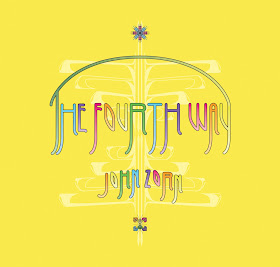
John Zorn - The Fourth Way
|
What is your favourite record cover you ever worked on?
No favourite or list of favourites. My portfolio has many pieces I really
like. Oracles series and Archival series would be on top. Non Tzadik clients
include Venamoris, Brian Carpenter, Medeski Martin & Wood, Erik
Friedlander, etc. MMW’s The Dropper featured Danny Clinch photography. I drew
the ephemeral characters and had special stamps made for the typography. Erik
Friedlander’s Maldoror is another one I’m fond of because of the illustration
and how it matched up between panels when folded.
In the past years you have created a number of impressive-looking box sets,
from the Song Project singles, the mammoth Book Beri’ah, 4 volumes of
Bagatelles, the
Song of Songs special project
and the reissue of the ten original Masada studio albums in a rich new
package. Could you describe how you worked on each of these releases, what
was the concept and how you made it happen?
John will describe where text and images go. Some boxes only have mostly text.
We need to know the basic colours, how much room there is for everything, and
if I need to come up with any artwork. I might augment with filigree. We pick
the fonts early in the process because it helps me design faster. Typography
adds a beautiful texture.
Song Project: Eleonora Ciara’s band photos and John Zorn’s collages are the
centerpieces. Each single follows a basic format with changing frames and
colour.
Book Beri’ah: This was mathematical for me with the Kabbalah’s geometrical
aspects. Typography was the visual focal point where it almost seemed like the
numbers and tracks would bounce around on a tree. Limited printing options or
lack of images can create the most classic and exciting design.
Bagatelles: This is an academic homage, design-wise. Each digipack is printed
with 2 colours (PMS and black). There is a stylized embossed “B” on the cover.
Simple, classic, and beautiful typography, changing shapes, icons, and colour.
Each box had a colour theme: bold, pastel, metallic, fluorescent… The coloured
gutters started as a printer’s mistake. We decided to keep it rather than
reprint. It became a permanent design element for the next sets since it
looked great. Notes panel: so simple, but not boring, at least to me. There’s
something about holding an item and reading heartfelt essays. It’s mostly
text, a simple photo, different icons per volume/set. Colours and finish add
to the feeling.
Masada 10 CD Boxed set: Arai Yasunori designed the original Masada CDs. We
wanted to keep a lot of the original images and his Hebrew letters. I redrew
his letters since there were no digital files for me. Unique filigree for each
volume. The large vector icons on the discs are period appropriate. They are
based on Masada site artefacts. The booklet has many essays by artists about
how Masada affected them. Very interesting stories. Design-wise it follows
some Archival classical music booklet ideas. Each set is elegant and
respectful of the music and subject matter.

|
|
Medeski Martin and Wood - The Dropper
|
Have you seen Mathieu Amalric’s movies about JZ?
He said he shot scenes about the artwork in the making, that almost made it
in Zorn III and might be included in Zorn IV. Are you looking forward to
that?
Definitely looking forward to seeing his latest volume of the Zorn series. He
once mentioned wanting to include the design process in an upcoming
installment. I haven’t been interviewed or filmed working on design. He
probably came up with a creative way to incorporate that aspect. Maybe he
filmed John, other artists, printers, A to Z Media, his collection, a museum,
a store…?
What is your view on Tzadik going digital? For a long time, it was all
about the record as a complete entity, which included music, artwork, fine
printing, resulting in a precious material artefact that felt good to touch,
as opposed to downloadable files. Will new Tzadik records still be published
as CDs or vinyl?
Digital streaming sites do not pay the artists well. Hard format is high
quality. I obviously prefer the old-fashioned full packages. Customers will
really be supporting the artists properly through hard copy purchases. I think
once they make a purchase, they will not regret it. We work hard to give them
a full experience. The artist’s vision is also in the packaging: information
not available through streaming sites. Everything — printing, notes, music —
is crafted and presented thoughtfully. We are still working in the CD format.
Occasionally there will be books, LPs, etc. I never assumed we would stop
printing. There is a Masada fan who has explained the importance of purchasing
the physical copies.
Here is a good link where people have discussed
this.

|
|
Arcana X (Book Cover)
|
Can you explain the Limited Run shenanigans? How was that distributor
articulated with Tzadik? In addition to the 3 benefit concert nights at
Roulette at the end of January, what are the plans to recoup losses?
SCP hosted and handled the Tzadik Limited Run site for limited edition
projects (LPs, Song of Songs book and boxed sets). They would receive customer
payments and mail the merch. Fans reported that the website was down after
attempting to purchase items late November. A month later, it was announced
SCP planned to file for bankruptcy. It means creditors, artists, labels, and
victims will be owed funds and their own merchandise. SCP owes Tzadik $70,000.
We will need donations. There are a few upcoming benefit shows and a special
benefit vinyl to help this situation.
Three nights of benefit concerts at Roulette in Brooklyn, NYC, January 25 to
27, 2024.
Limited-edition New Masada Quartet Vol. 1 vinyl will be available from
Redeye distribution. 200 signed by John Zorn are available for preorder from
Downtown Music Gallery.
Hips Road always accepts donations made out to Hips Road.
Mailing address is 200 E 10 ST, PMB 126, New York, NY 10003, USA.
PayPal is also an option. Write to
info@tzadik.com for the address.

|
|
John Zorn - Song of Songs
|


